ProjectsUser research
Implementing self-checkouts at the University of Toronto's dining halls
The University of Toronto Mississauga's three dining halls serve nearly 15,000 students daily, yet students face many challenges when purchasing their food. Wait times are long, lines are confusing, and checkout stations are understaffed. We aimed to understand student's frustrations while at a dining hall, and designed a new self-checkout system to create a more efficent experience.
Role
UX designer
UX researcher
Project Type
Class Project
CCT380 @ University of Toronto
Timeline
Jan 2022 – Apr 2022
Scope
User research
Sketching & wireframing
Prototyping

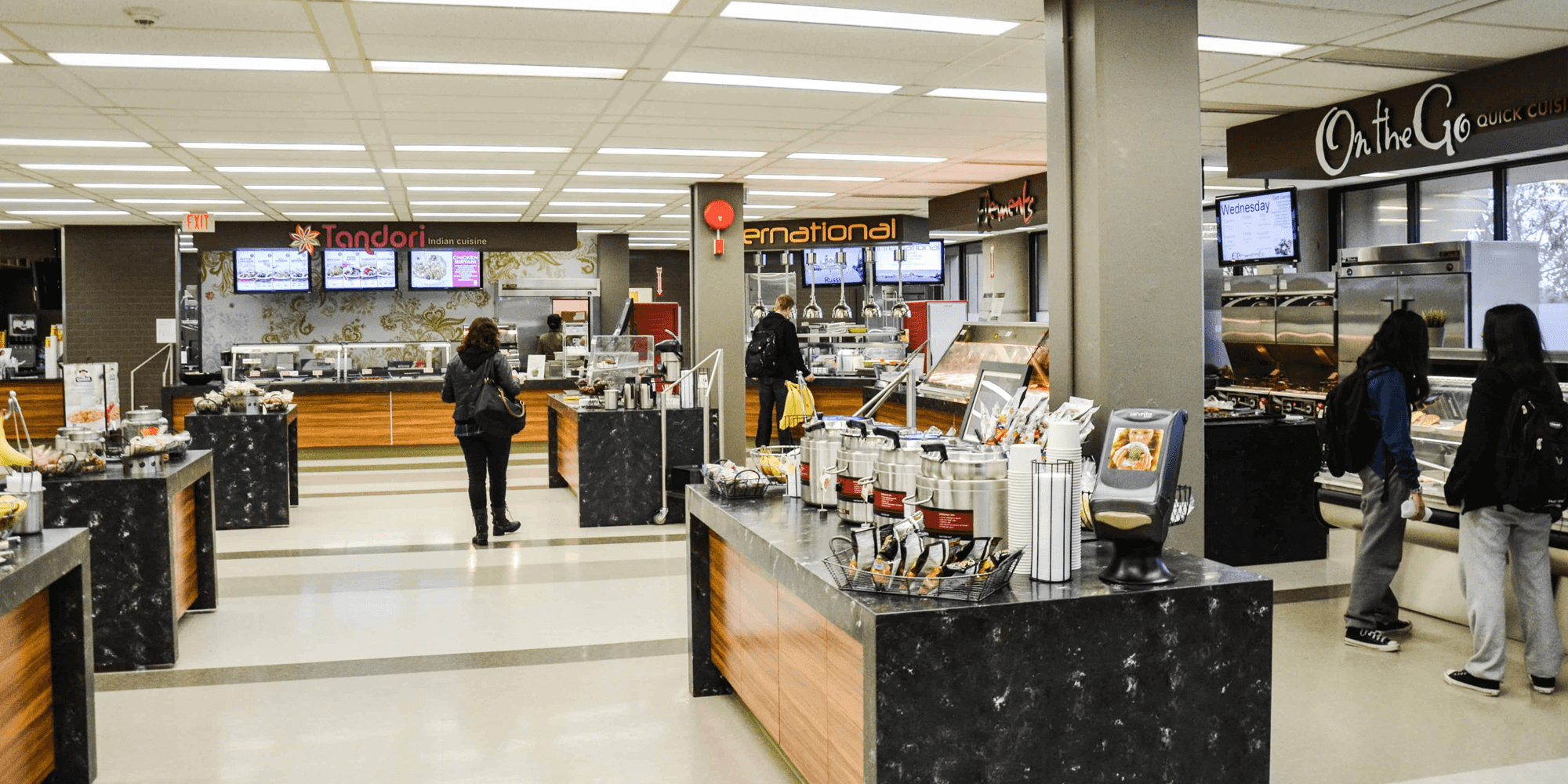
The Davis food court at the University of Toronto Mississauga.
Photo by The Varsity
Challenge
The University of Toronto Mississauga (UTM) has three dining halls: the Davis food court, Coleman Commons, and Subway and Bento in the Instructional Center. Each day, these locations serve the campus's 15,000 students. Dining on campus is a necessity for many students, who often lack access to affordable alternatives. Despite its importance, using a dining hall is a time-consuming endeavor that provides obstacles for students and ultimately causes the university to lose money.
While each dining hall has three checkout stations where students can purchase food, only one or two kiosks are open at any time. In addition, while some locations have designated payment queues, the lines are often unstructured and can obstruct access to other parts of the cafeteria. This combination of unmanned kiosks and obfuscated queues discourages students from eating and can negatively impact their health.
Observations
Our team visited each dining hall to observe a student’s typical interaction with the dining hall experience. We measured the time it took students to move through the process, from waiting in line to order to their eventual payment. We observed a significant bottleneck during the period after a student received their food and before they paid. In each dining hall, makeshift lines formed randomly behind the open checkout kiosks and provided much confusion to the students queuing.
In addition, some dining halls, like Coleman Commons, placed the checkout kiosks in the same location as the entrance. This forced students entering the dining hall to navigate the cluster of students waiting to pay. These obstacles are often exacerbated by the lack of staffed checkout stations – during our observations, a maximum of two kiosks were manned at any given time. In rare instances, none of the kiosks were open, leaving students to wait for a staff member to return before they could eat.
| Dining Hall | Wait Time Food Ordering | Wait Time Food Prep | Wait Time Checkout | Total Time From enter to exit |
|---|---|---|---|---|
| Davis (Peak) | 20 mins | 11 mins | 10 mins | 40 mins |
| Davis (Off-Peak) | 5 mins | 10 mins | 2 mins | 17 mins |
| IB (Peak) | 20 mins | 12 mins | 11 mins | 43 mins |
| IB (Off-Peak) | 10 mins | 8 mins | 3 mins | 21 mins |
| OPH (Peak) | 15 mins | 10 mins | 17 mins | 45 mins |
| OPH (Off-Peak) | 6 mins | 7 mins | 5 mins | 19 mins |
To properly identify wait times as a pain point in this process, we considered the university's previous attempts at remedying the situation. First, the university instituted a “grab and go” system where students ordered food before reaching the dining hall. While this reduced the total wait time, students were still forced to wait in the checkout line along with the non-”grab and go” customers.
Proposed Solution
Our observations demonstrated that students required more methods of paying for their food. This problem is rooted in an institutional failure: the university lacked the manpower to properly staff its dining halls. To address this issue, we sought to create a self-checkout system that did not rely on further staffing.
Self-checkouts are an industry-proven solution to this problem, implemented by major commercial stores throughout the country. While staff members are still required to address any issues that arise in the self-checkout process, the machines would represent an easier way for students to pay while providing more points of sale to handle congestion.
Prototyping
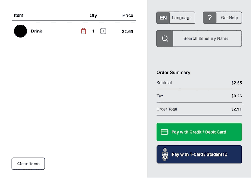
Our team developed a hardware prototype of the self-checkout environment with an accompanying digital interface. The prototype included all the standard functions self-checkouts require: an item scanner, a payment gateway, and an interfacing guiding users through the system.
The prototype saw two major iterations: a makeshift cardboard box with a laptop situated atop and an all-cardboard design replicating a traditional self-checkout kiosk. The initial design allowed us to test and experiment with the digital interface, while the second design sought to provide a holistic view of the system.
Prototyping the digital design began with sketching, moved to low-fidelity wireframes, and ended with mockup prototypes.

Usability Testing
We conducted testing with 7 undergraduate students who frequent on-campus dining halls. The testing involved 4 unique scenarios testing the various observed pain points, like T-card payment methods, and potential pain points that other self-checkouts faced, like removing an item from the cart.
The testing revealed issues with the way the interface communicated payment error messages. When students lacked funds on their T-card, the interface initially gave users a generic “payment rejected” message. Later revisions gave users a variation of error messages, like informing them of insufficient funds and showing their current meal plan balance.
Outcome
This was not an official study commissioned by the University of Toronto, nor is it affiliated with the university. It was conducted during a user experience design course and, although it was not intended to reach production, our team learned several valuable lessons from the process:
- An institutional failure doesn't mean there's no solution. When there's an issue at an institutional level, don't give up! Ideation can provide new solutions and alleviate pressure on the institution.
- Link design requirements to specific pain points. It's easy to jump into a design and make claims about the user's needs. Associating those needs with specific pain points ensures you've addressed all of the user's problems.
- When prototyping, you should simulate the whole environment, not just the digital screen. A screen alone cannot simulate a user experience when physical actions are required.
- Observe without interfering. Sometimes you must be like David Attenborough and observe users in their natural habitat. When users don't know they're being observed, you might find more accurate data!
It's worth mentioning that the university installed self-checkouts in its dining halls a year after our study. Did we have anything to do with it? Maybe! Okay, probably not. But do we feel vindicated? Absolutely.