ProjectsUser research
Centralizing study room booking at the University of Toronto
The University of Toronto has over 40 libraries, yet students can only reserve study rooms online at two of those libraries. We aimed to understand students' frustrations when booking a study room, and designed a new system that centralizes the process across the university.
Role
UX designer
UX researcher
Project Type
Class Project
INF352 @ University of Toronto
Timeline
Sep 2022 – Dec 2022
Scope
User research
Information architecture
Sketching and wireframing

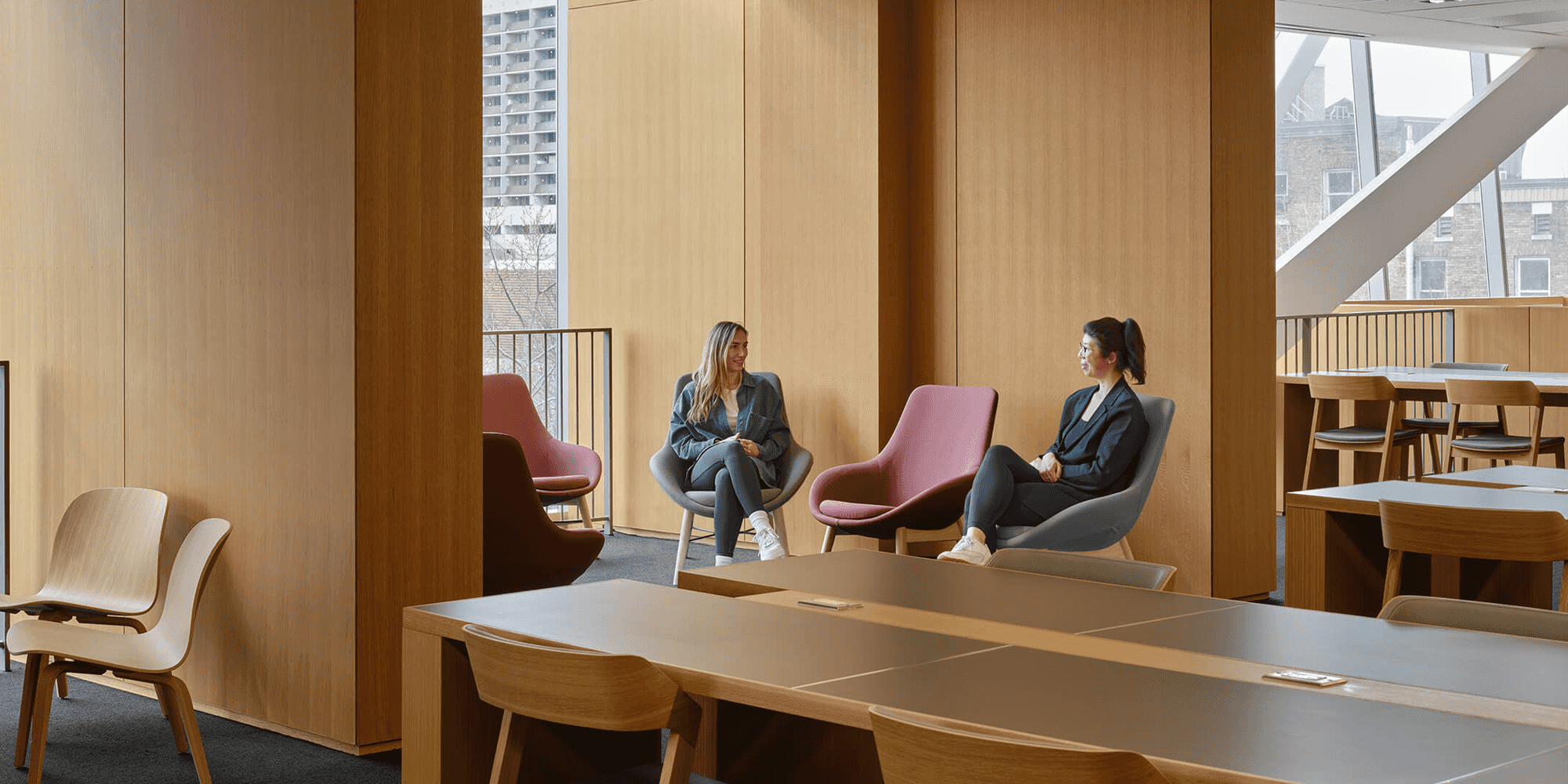
A study area in the University of Toronto's Robarts Common building.
Photo by Smith + Anderson
Study rooms provide an essential service to students. They are a quiet space where students learn and research individually, and they give opportunities for students to join together and collaborate in small groups. The University of Toronto has over 40 libraries, many of which house study rooms for students, faculty, and staff. As of December 2022, study room booking systems only support two of those libraries: the John P. Robarts Research Library and the Gerstein Science Information Centre. Students looking to book rooms outside of these two locations must speak with a librarian either in-person or over the phone. This limitation creates barriers for students looking to venture beyond the two largest and most crowded libraries on campus.
The project aims to understand students' frustrations when booking study rooms at the university's libraries. It examines and addresses the problems students face when utilising study rooms by creating a more efficient booking system and bringing greater awareness to the various study locations available on campus.
Why does this matter?
The University of Toronto invests heavily in their libraries and its accompanying resources for students:
- The university's 2022-23 budget allocated CAD$122 million for the administration of its libraries
- In 2022, the university spent CAD$25 million to develop Robarts Common, an expansion to the Robarts library that provides additional study spaces for 1,200 students
- In 2008, Ontario contributed CAD$15 million to develop additional study spaces for 1,500 students
Despite these large financial investments, many students are unaware of all the opportunities on campus. Those that are aware may not understand how to take full advantage of these resources or may find the process cumbersome.
Target Audience
We begain by defining our target audience as students at the University of Toronto. This technologically literate group posesses the ability to find and reserve study rooms, but often lacks the time or mental bandwith to look beyond what's made easily accessible. This group is the foundation of our user profile, and is identified by the following characteristics:
- Undergraduate or graduate students
- Aged 18 to 30
- 42.9% male, 54.7% female, 2.4% non-binary
- Domestic or international
- Multicultural and multilingual
- Living on residence or commuting to campus
- Commits several hours per day to school research
- Participates in group study sessions, or has group assignments
- On-campus for an average of 6 hours every day
- Has 10-20 hours of research per week
- Conscious of academic commitments and responsibilities
User Persona
To help us empathize with our target audience, we created Steve, a 20-year-old undergraduate student majoring in political science. He's on-campus almost every day and spends hours each week in a study room researching on his assignments. Steve is overresearched; his classes are demaning and he has several assignments due each week so he lacks the mental bandwidth to focus on anything beyond his academics.
With plans to attend law school, Steve spends much of his free time preparing for the LSAT. He does this by studying quietly on his own and researching with a larger group of pre-law students to practice for the exam. It takes Steve over an hour to commute to campus, so he is easily irritated when someone else uses his booked study room or when his friends forget about their study session.
Steve needs a way to quickly and efficently view all of the study rooms on campus so he can reserve a quiet space to focus on his research.
Interviews
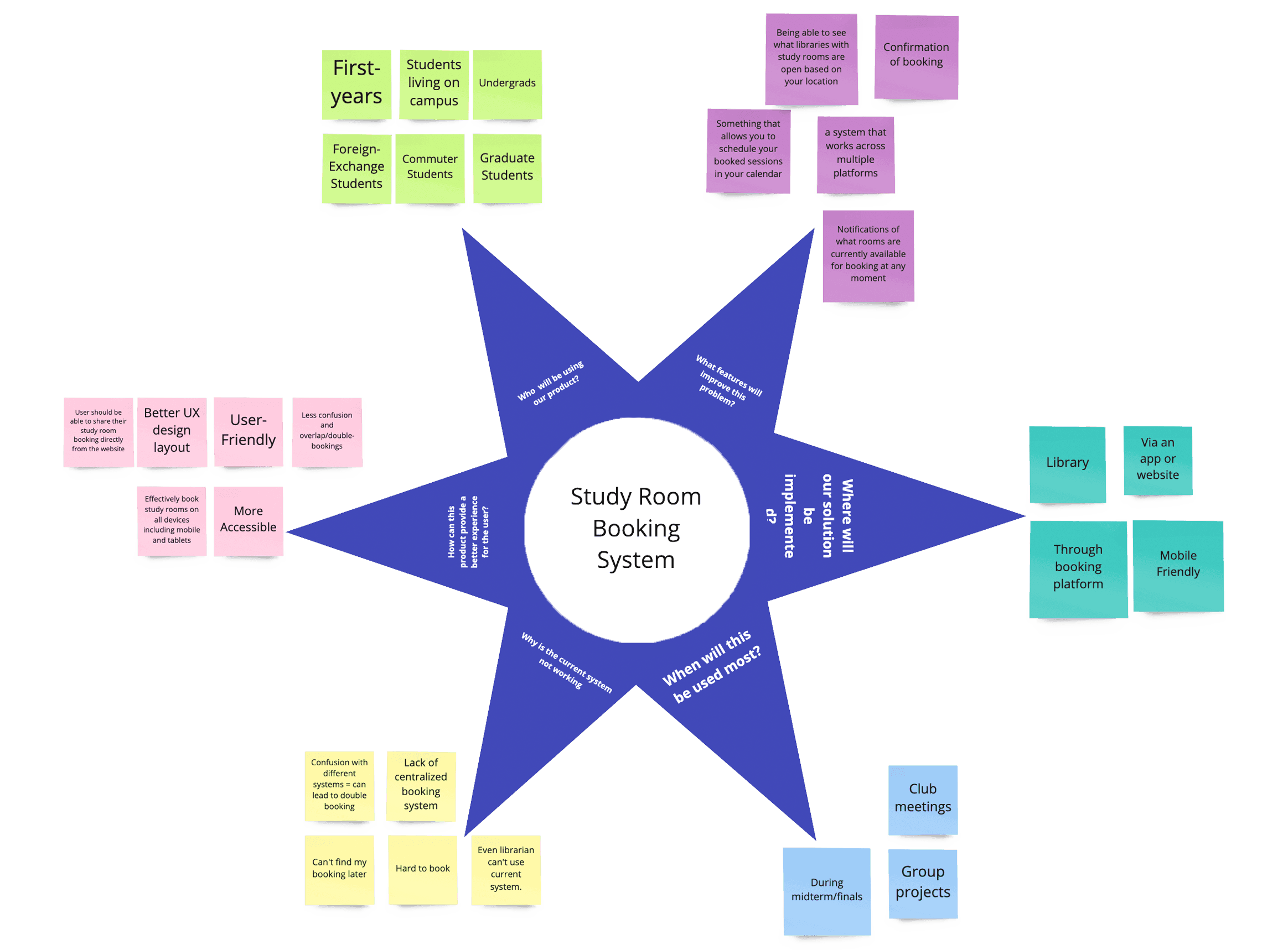
To better understand students' frustrations, we interviewed 8 students matching our user profile who shared their thoughts on the current study room booking system. The students gave us significant insights into how they use study rooms and what their experiences were when booking a study room:
- All of the students we interviewed only booked study rooms in Robarts or Gerstein. Students are unaware of options in other locations, and the system made using other libraries far less accessible.
- Students allot roughly 5 minutes of their time to book a study room. Students have busy schedules, and they don't want to go through the hassle of speaking with a librarian to reserve a study room.
- Many of the features students expected from a booking system were missing. Students frequently use reservation systems for airlines, hotels, and restaurants, and their mental models expected abilities like inviting guests or seeing the features associated with a room.
Proposed Solution
The data collected from our interviews indicated that students would greatly benefit from a centralized booking system that allows users to reserve study rooms across the university. The project has one primary goal: making study rooms more accessible. This goal is difficult to measure, but we can generally measure the project's success using the following metrics:
- Students reserving 80% of study rooms using the new system, with the other 20% accounting for cancellations, walk-ins, and in-person reservations.
- A 60% occupancy rate of study rooms on campus at any given time.
- A 20% increase in reservations for rooms currently supported by a booking system, which can be compared using data from Robarts and Gerstaein’s current booking platforms.
- A 40% increase in visitors to the university’s specialty libraries, which can be measured by the T-card entry records of each location.
A centralized room listing is not a new concept to the university. The university created a mobile app called Sync Search, listing vacant classrooms available to students. Although not a booking system, it does include features like showing the nearest study space and adding a particular location to your favorites. This could provide a frameresearch for our system, possibly reducing the cost of this project and decreasing the development timeline.
Prototypes & Usability Testing
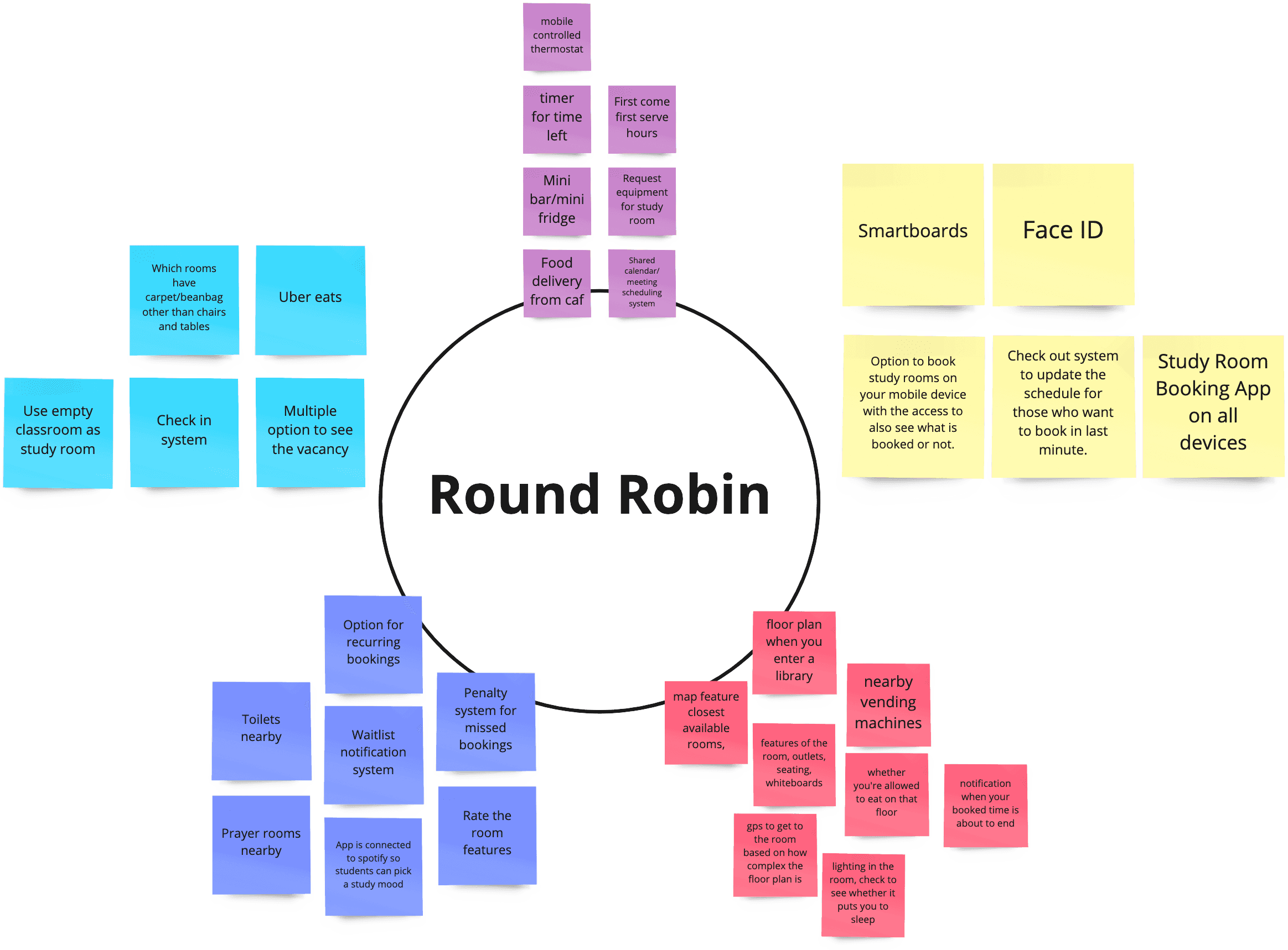
The final phase of the project was to design interface prototypes, test them with users, and then create wireframes. We began this phase sketching out the key features we desired, like a calendar interface. Each team member created a sketch for a given page, and then we discussed each design, using dot voting to decide the pages and features we wanted to include.
We conducted usability testing with 4 different members of our target audience. We developed a user testing protocol, outlining our testing objectives and providing us with a scrpit to follow during an interview. Testing revealed several areas where our designs conflicted with our users' mental models, namely in button or navigation labels, the interactivity of the system, and in the search bar on our main page.
Using feedback from our usability testing, we developed wireframes in Balsamiq to provide a more polished and comprehensive prototype.
Outcome
This was not an official study commissioned by the University of Toronto, nor is it directly affiliated with the university. It was conducted during a user experience design course and, although it was not intended to reach production, our team learned several valuable lessons from the process:
- It is essential to empathize with the humans using a system. Without empathy and understanding, we risk creating a system that ignores our users' needs and desires. We must always keep users in mind when designing a product.
- Design is an iterative process, and failure is inevitable. The phrase "fail early, fail often" was a helpful reminder throughout our research, and we constantly learned from our mistakes to deliver a better product. This was especially true during usability testing, when our designs were challenged by our users' mental models. We must embrace these shortcomings and recognize that they provide learning opportunities.
- Usability testing helps identify pain points in a system. Even if you can only test with a few users, the process provides valuable feedback that can inform future design decisions.
- Our idea is not the only solution. When we pitched the project to our class and professor, we heard ideas and opinions that we hadn't considered. This is a reminder that our peers and clients can provide valuable insights into a project, and we should be open to hearing their feedback.

